Android Q(Pre Released) V Android P; See what's the New Changes in Android Q
Google has today released the first beta for Android Q and it brings a whole slew of changes both big and small. Well, we’ve been using the Android Q beta on our Pixel 3 XL and the Pixel 2, and we’ve noticed a lot of changes here. So, if you’re wondering what the latest flavour of Android might bring to the table, here’s everything that’s changed with Android Q.
1. Dark Mode Toggle Is Gone, But Dark Mode Is Here
2. Revamped Share Menu
With Android Q, Google has revamped the share menu and it’s now not only a lot more useful in the sense of design, and the way apps and shortcuts are arranged, it’s also quite a lot faster than it was before. This is because unlike in previous versions of Android where the share menu had to poll each app individually to figure out the actions they might support, Android Q uses a push-based solution resulting in a very noticeable speed bump.
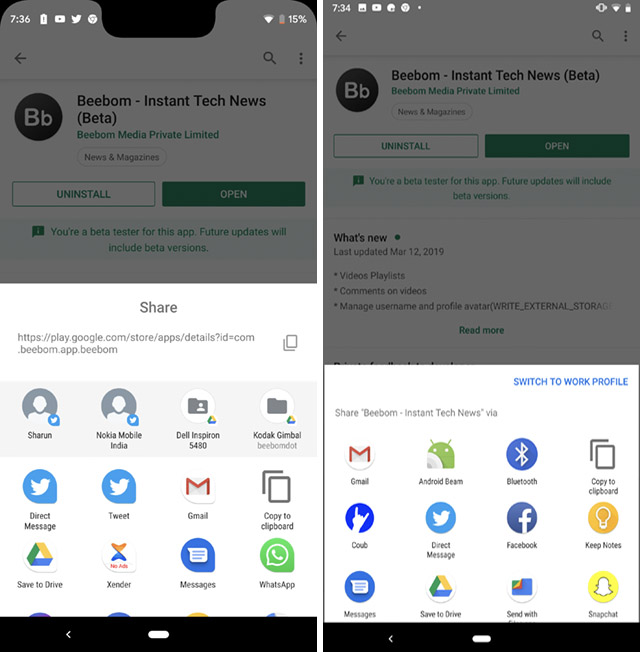
You’ll also find the copy-shortcut right up top so you can quickly copy links without having to search for the ‘Copy Link’ option in the share sheet. This is definitely a welcome addition.
3. WiFi Sharing with QR Codes
With Android Q, you’ll be able to share your WiFi networks with other devices quickly by using QR codes, and without having to share your password with them. In the WiFi settings, you will now see a new ‘QR Code’ option along with the option to ‘Forget’ a network. Simply tap on this and you’ll be shown a QR code that other devices can scan and connect to the WiFi network directly without having to type in the password or anything else.
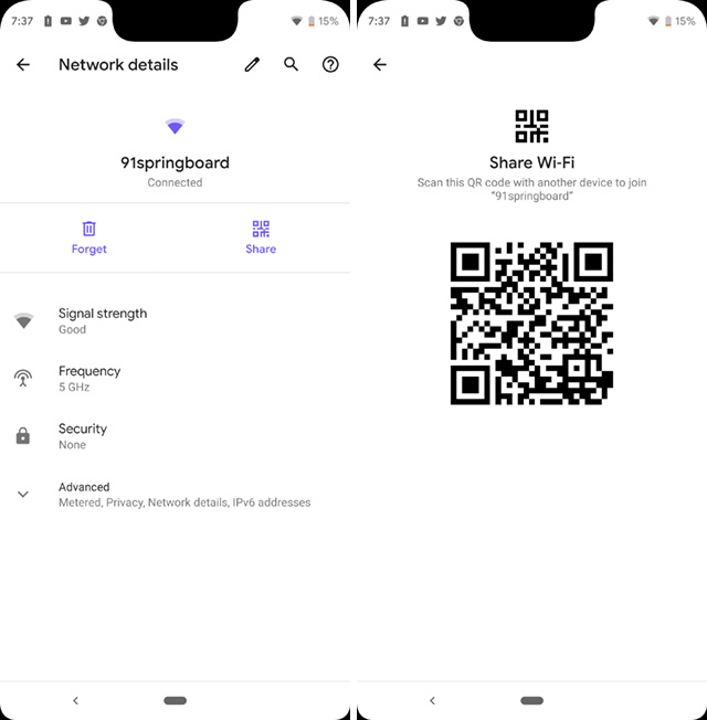
For some reason, Google Lens wasn’t able to scan this QR code and join the network, but some third party apps like CoReader (free) are able to do this.
4. QR Scanner in WiFi Settings
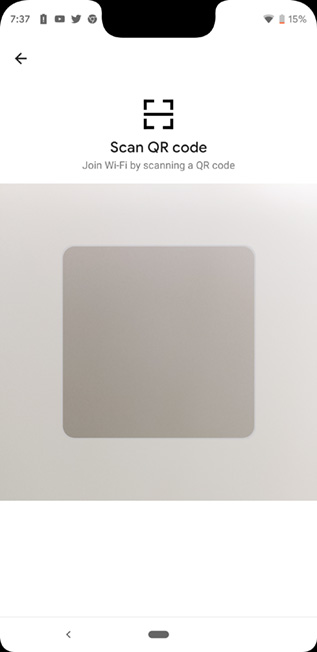
If you’re trying to connect to a WiFi network via a QR code on an Android Q device, you don’t need a third party app. You can head over to WiFi settings, and at the bottom there’s now a new QR scanner option that you can open and then scan WiFi QR codes to directly connect to them.
5. Notches Now Show Up in Screenshots
Remember how taking screenshots on a notched phone would result in a regular looking screenshot? Well, not anymore. With Android Q, if you’re taking a screenshot on any phone that has a notch (so far that means the Pixel 3 XL), your screenshot will also show the notch, along with the rounded corners of the phone’s display.
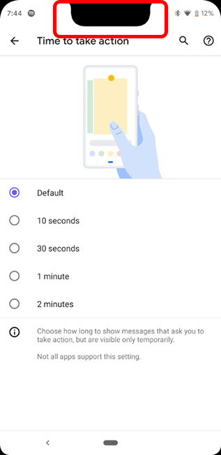
Now, I’m not sure exactly why this was done, and I personally don’t really like it, but that’s what it is now.
6. Theming Options
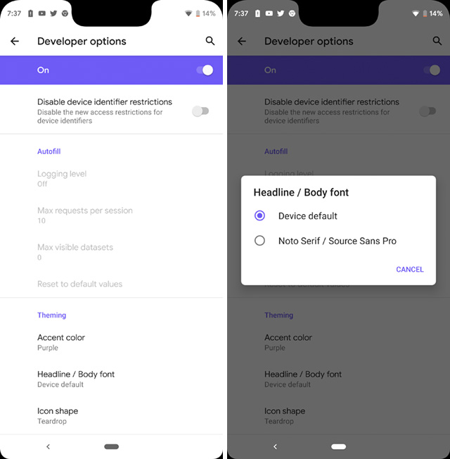
Android Q now also brings theming options to your phone. So, you won’t have to rely on third party apps to theme your phone like you had to on Android Pie. Currently, Android Q’s theming options are at the very end of the Developer Options, and you only get to change things like the accent color, the icon shapes, and the font (of which there are only two), but let’s hope Google adds more choices to the theming system in Android Q soon.
7. Granular Location Permissions
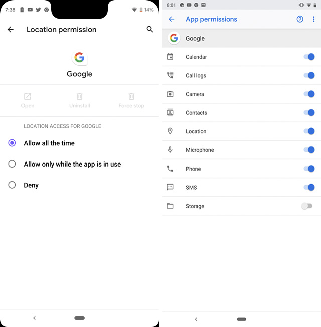
Unlike Android Pie, Android Q puts a lot of focus on privacy, and one of the major changes in that regard comes with more granular control over location permissions. Unlike Android Pie, where you could allow or deny location access to apps, Android Q brings support for options that let you always allow location access, deny access, and even to only let the app access your location while it is being used. It’s quite similar to the way iOS handles location permissions with apps that choose to support it, and it’s definitely great from a privacy point of view.
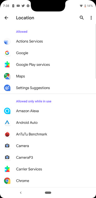
Even the permissions screen has changed. Instead of arranging apps alphabetically like Android Pie did, Android Q categorises apps by ‘Allowed,’ ‘Denied,’ and ‘Allowed only when in use’ so you can easily find the apps that are accessing your location, and apps that simply can’t access your location at all instead of having to scroll through a long list while keeping an eye on the toggles to check whether an app has location permissions or not.
8. Notification Swipes Have Changed
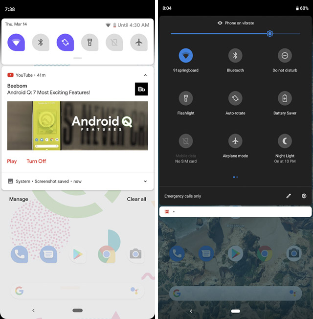
In Android Pie, a short left-swipe on a notification would bring up options like snoozing a notification, or changing the notification settings for the app, and a long swipe to the left or the right would clear the notification from the panel. However, with Android Q,left swipes are reserved for snooze and notification options, and you can only clear notifications by swiping to the right.
9. Quick Settings Now Shows Remaining Battery Life
In Android Q, when you drag down the notification shade, you will now be able to see the expected remaining battery life of your phone right there without having to go into the battery settings. In comparison, Android Pie only shows the expected remaining battery life on opening the battery settings.
10. Long Pressing Notifications Shows More Settings
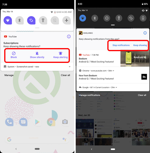
If you long press on a notification in Android Pie, you get just two options: ‘Stop notifications’ and ‘Keep showing’. However, in Android Q, if you long press on a notification, you get options such as blocking notifications from the app, showing notifications silently, or continue alerts for such notifications.
11. Redesigned Files App
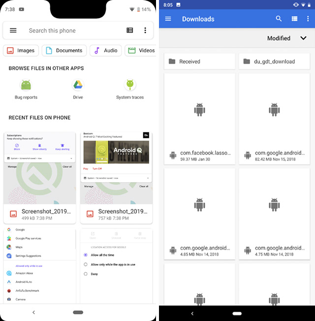
The built-in file manager that ships with stock Android has also been revamped in Android Q. Unlike the older Files app that you’d find in Android Pie, the new Files app brings a lot of material design upgrades. There are tags up top to quickly look for videos, images, and other files. The hamburger menu now uses Google’s new material design guidelines and just looks a lot better. It’s just overall a much better experience.
12. Undo Accidental Home Screen Deletions
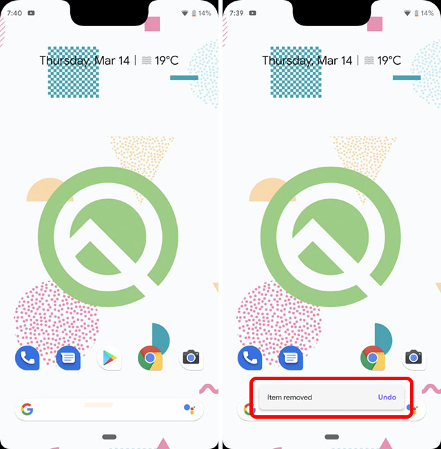
With Android Q, the default Pixel Launcher now has support for undoing actions such as removing widgets or apps from the home screen. Unlike in Android Pie where deleting an app or widget simply removed it from the screen, Android Q now pops up an ‘undo’ option that you can tap on to bring back the last removed widget or app. This can definitely come in very handy.
13. Settings Page
The settings page has obviously seen some slight changes, it’s pretty much customary at this point. In Android Q, you’ll see separate settings for Privacy, Location, and Security, whereas in Android Pie there was simply a Security and Privacy setting which contained all the settings.
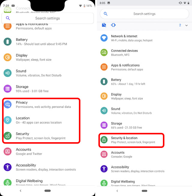
These new, separate settings also make it easier to surface things like App Permissions, and more which is just great.
14. Random MAC Addresses
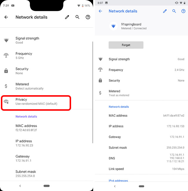
In Android Pie, Google introduced Random MAC addresses that allowed devices to connect to WiFi networks using MAC addresses that were randomized for added privacy. With Android Q, randomized MAC addresses are a default setting, and if you’re looking to use your own MAC address to connect to a network you’ll have to manually change it from within the WiFi network’s settings. If you’re someone who wants added privacy, especially while connecting to public WiFi networks, this is a change that you’ll like.
15. Battery Icon’s Position in Always On Display has Changed
In Android Pie, the battery percentage used to show up at the bottom of the always on display. However, with Android Q, the battery icon, along with the percentage, now shows up at the top-right, which is where it would usually reside when the screen is turned on. Personally, this looks a little imbalanced to me, but it’s a subjective issue.
16. New Gesture for Switching Apps
Even though Android Pie took the plunge into gesture based navigation, and you could switch between recent apps by simply flicking the navigation pill to the right, Android Q brings a new gesture for switching between apps. You can now slightly swipe-up-and-right on the navigation pill to switch to the last most recently used app on your phone. Now, while this gesture itself feels more cumbersome than the flicking gesture that was there in Android Pie, the new gesture doesn’t use as many animations, which makes it considerably faster at switching between apps.
Both the gestures are available, as of now, so you can use whichever one you prefer. That said, the back button, which was expected to be removed in Android Q is still here, so maybe Google is still finalising its plans for Android Q’s gestures.
17. Built-in Screen Recorder
With Android Q, Google finally includes a built-in screen recorder so you no longer need a third party app to record the screen on your phone. However, the screen recording feature is sort of hidden, and you can check out our guide on how to enable screen recording in Android Q to turn it on.
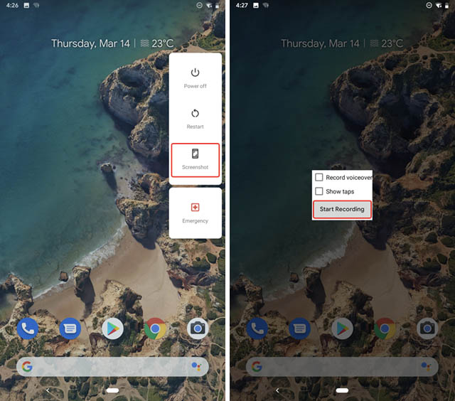
Do keep in mind that this is still in its early stages of development, so it might not work as expected. In our testing, the screen recorder worked on our Pixel 2, but kept crashing on our Pixel 3 XL. So your mileage may vary.
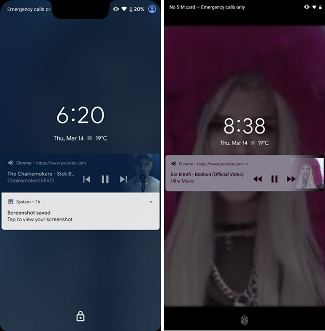
18. Currently Playing Music is Shown in Always on Display
With Android Q, Google is adding more information to the always on display on the Pixel. Unlike with Android Pie, where the phone only showed things like notifications, weather, and the clock, Android Q now also displays currently playing music on the always on display.
19. Blurred Lock Screen Background When Playing Music
Speaking of playing music, the lock screen background in Android Q is blurred while there’s music playing on the phone, unlike in Android Pie, where the lockscreen background was simply the album art for whatever song you were listening to. This new lockscreen does look better and makes it easier to read notifications, so I’m not complaining about it.
20. Haptic Feedback While Selecting Text
In Android Q, Google is adding more haptic feedback to the OS. Now, whenever you long press on a website in order to select text, you’ll get a haptic feedback. Plus, scrolling to select more or less text also gives a very satisfying haptic feedback, especially on the Pixel 3 XL with its improved haptic engine. In older Pixels, like the Pixel 2, the feedback isn’t as good. Anyway, there’s also haptic feedback on the Pixel 3 when you use the Flip to Shhh feature, and it’s also incredibly good.
21. Recent Apps Have More Rounded Corners
The Recent Apps screen in Android Q has also changed. While Android Pie showed apps with slightly rounded corners in the recent apps, with Android Q the corners are more rounded and more pronounced.
22. Floating Settings Panels
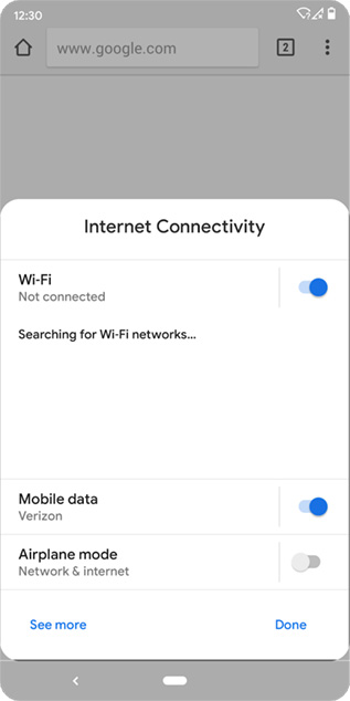
Android Q brings support for third party apps to pop up floating panels showing relevant settings that the app might need you to enable, or configure. For example, you might see a panel pop up asking you to connect to or enable WiFi when you’re trying to use Google Chrome. This will make it easier for users to enable these settings without having to leave the app. We tried to get this to work with a bunch of apps, including Chrome canary, but it wasn’t working. However, it’s a supported feature according to the Android developers’ blog, so I’m pretty confident it should make its way into atleast Google’s own apps soon.
23. App Info Page Has Changed
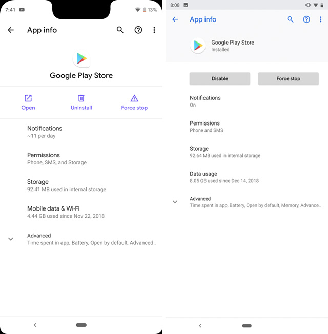
Android Q also revamps the app info page. The new page now shows the app icon and name in the center in bold letters, with options like open, uninstall, and force stop beneath it. The rest of the page has the same things for the most part, but the Notification tab shows the average number of notifications the app sends per day in Android Q, instead of just ‘On’ or ‘Off’ in Android Pie.
24. The Enter Key on the Lockscreen Is Now Accented
If you’re using a PIN or a Password as your lock, Android Q now colors the enter key on the lock screen with the accent color you’ve chosen. By default, this color is blue, but if you’ve used the theming options to change the accent color, that’s the one Android Q will use. In Android Pie, on the other hand, the enter key wasn’t accented at all.
25. There’s Now a Media Output Switcher
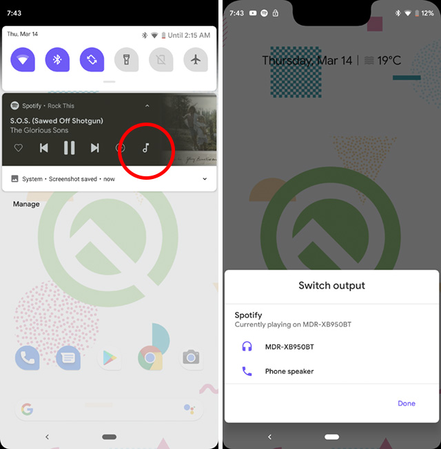
Android Q now brings support for separate app audio outputs, so you can set an app like Spotify, to send its audio output to a Bluetooth speaker, while the rest of the phone uses the phone’s speakers for sound. This feature has to be enabled by heading into the feature flags option inside developer options, you can check out our article on hidden Android Q features to check out exactly how to enable this feature.
26. Time to Read/Time to Take Action Can be Adjusted
Android Q also brings a new accessibility setting that lets users adjust the time to read and time to take action for messages that temporarily show up on the screen. Time to Read affects messages that display information but don’t have any action buttons, and the value can be adjusted between 10 seconds and 2 minutes.
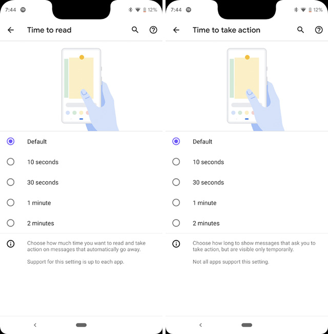
Time to take action, on the other hand, affects messages that allow you to take some action on them (such as screenshot notifications that show options like share, delete, and more) and this value can also be adjusted between 10 seconds and 2 minutes.
Do note that these values will only affect apps that support time to read and time to take action accessibility features.
27. Sideloading Apps Doesn’t Take Up the Full Screen Anymore
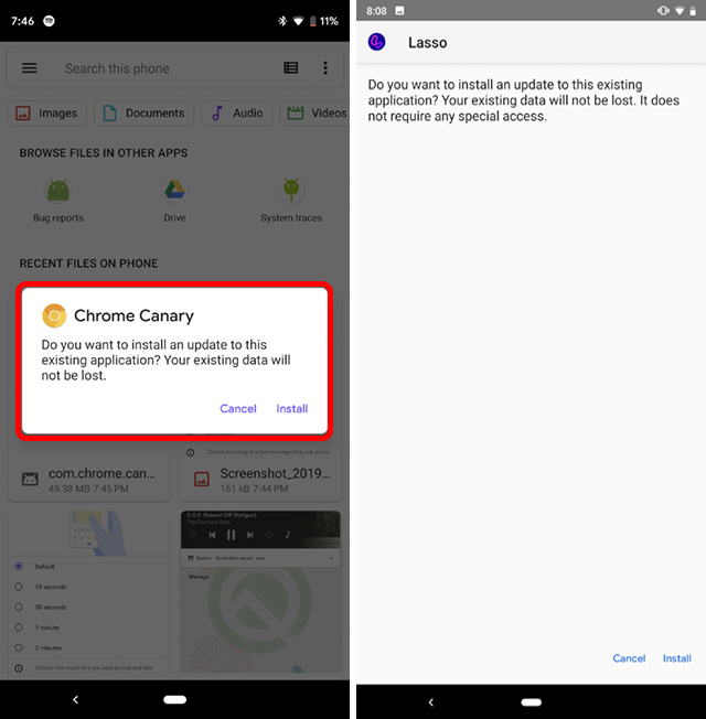
Sideloading apps on Android Pie launched a full screen interface for installing the app. However, with Android Q, when you’re sideloading an app, Android will not launch a full screen interface. Instead, you’ll just see a small pop-up on your screen, which is definitely a lot better. Plus, it will reduce the number of places companies can put ads inside their interface as some companies are known to do.
28. A New ‘Bell’ Icon Now Shows Which Notification Just Rang
If you’re someone who has a lot of notifications in their notification panel almost all the time, it can sometimes be difficult to figure out which notification just made a sound on your phone. At least that was the case up until Android Pie. However, in Android Q, the last notification that made a sound has a new ‘bell’ icon for around 30 seconds after it rings, so you can easily find it.
29. Freeform Apps
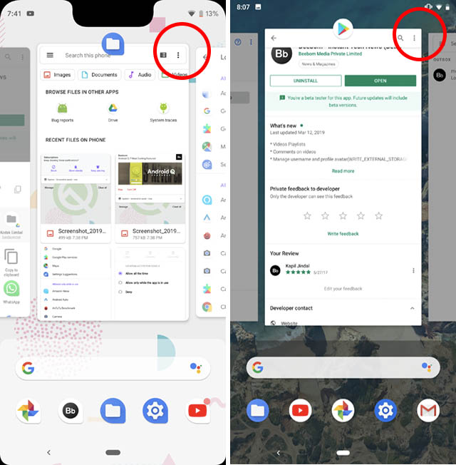
Android Q finally lets you test freeform apps on the phone. These are incredibly cool. All you have to do is head over to developer settings and enable the setting that says ‘Force freeform apps.’ Then you can simply tap on an app icon in the recents screen, and use the ‘Freeform’ option from the dropdown menu to force the app to launch as a floating window.
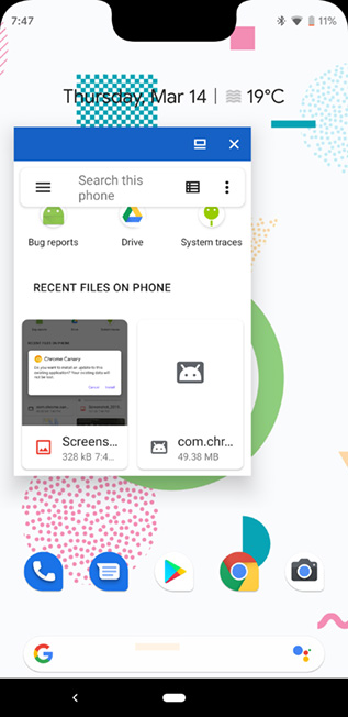
In the current beta, we were only able to get one floating app working at a time. As soon as we launched a new one, the previous one got closed automatically.
30. Desktop Mode
Just like Samsung introduced DeX, Android Q now brings a desktop mode that will basically let you connect your phone to an external display and use it as a PC. As of now, the feature is pretty buggy and clearly in the early stages of development. However, the UI does look a lot like Chrome OS, so you never know, maybe once the feature is ready to be rolled it gives Pixel owners the capability to use their smartphones as their PC too!
SEE ALSO: 10 Best Android Q Features
Android Q Changes Quite a Bit
Even though, at first look it might not feel like Android Q really brings a lot of changes as compared to Android Pie, when you dive a little deeper, there are a considerable amount of changes here. Plus, there are also a ton of developer-oriented changes in Android Q including things like support for foldable displays, depth maps, and a lot more. This is just the first beta of Android Q, and as Google releases more Android Q betas, there’ll be even more changes, so keep checking back for more.


Post a Comment